A new look, and marking that shows its working
Beacon has been rebuilt, dark mode included. Underneath it, the interview now asks about what your CV does not cover, and the match rate is worked out rather than asserted.


In this article · 6 sections
- A new look, and a dark one
- Interviews now ask about what is missing
- Your match rate reflects the session, not just your CV
- Answers are marked on what they actually contain
- Progress tells you what to fix first
- What this means for sessions you have already done
Practise for your next interview free, with no card.
Sign up freeBeacon has had its first full redesign since launch, and the part that matters most has changed underneath it: how a session is marked. This post walks through both, with the actual screens.
A new look, and a dark one
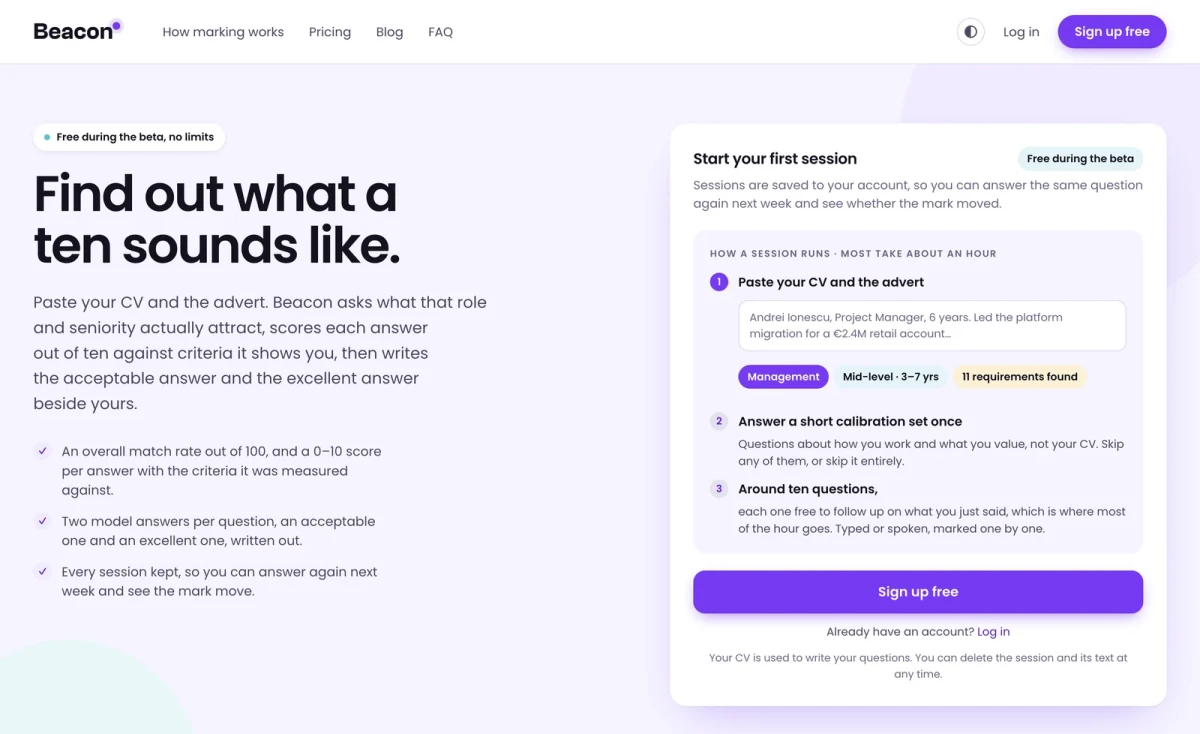
Every page has been rebuilt. The marketing site, the sessions list, your progress, the results, the settings. The old admin theme the signed-in side inherited is gone entirely, and both halves of the product now share one design system.
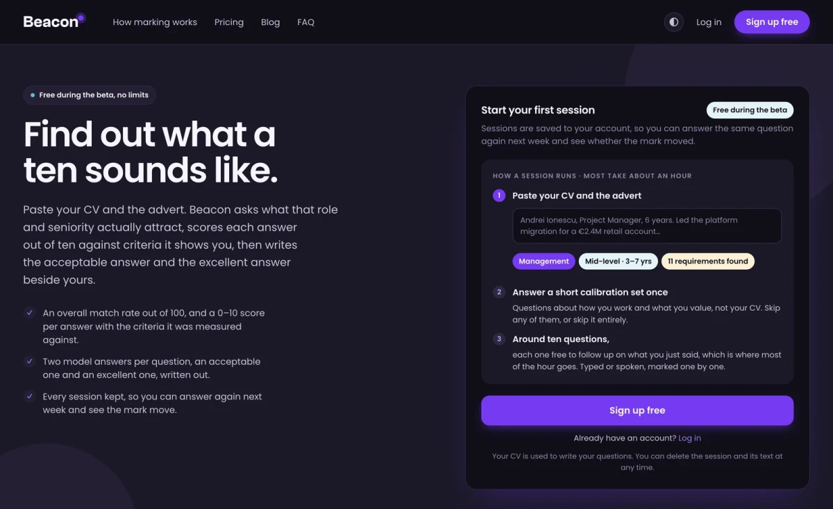
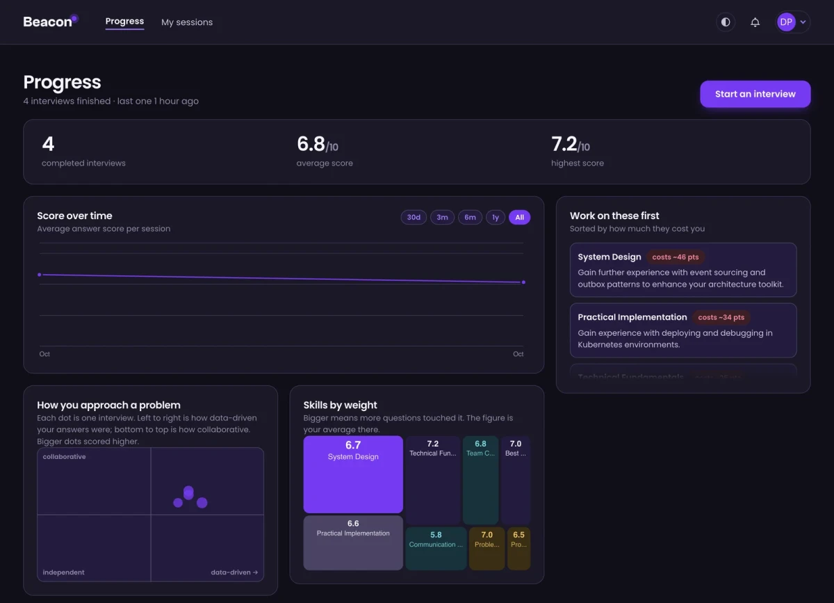
Dark mode arrived with it, for the first time. It follows your system setting by default, and the control in the header pins it light or dark if you would rather choose. It is a real theme rather than an inversion: the colours were picked per theme, and the ones used as fills are never put behind a word.
The pages also got considerably lighter. A signed-in page used to ship about 126 KB of CSS and 652 KB of JavaScript. It now ships 52 and 185. That is the difference between a page that waits for the network and one that is simply there, and it shows most on a phone.
Interviews now ask about what is missing
This is the change we would point at first.
Beacon used to write your questions and work out the advert's requirements in the same breath, in that order. In practice that meant it decided what to ask before it had worked out what your CV did not already cover. In one of our own test sessions it correctly identified Kubernetes and GraphQL as things the advert wanted and the CV did not show, and then asked about neither.
Reading the advert is now its own step, and it happens first. The questions are written afterwards, with the unmet requirements in hand, and each question records which requirement it is there to test. A requirement nobody asked about is logged rather than quietly forgotten.
The practical effect: if the advert asks for something your CV does not evidence, you get a question about it. That is the only part of the interview that can still change the outcome, so it is the part worth spending questions on.
Your match rate reflects the session, not just your CV
The overall match used to be a single judgement the model made at the end, and it had a habit of not moving. One of our test sessions scored eleven answers between 4 and 8 and finished on exactly the number it had started with, because the final step was never shown the initial reading or any of those scores.
It is now worked out rather than asserted: from the requirements the advert states, how much each one counts, whether the session actually showed them, and how the answers scored. Same figure, arrived at by arithmetic that can be checked.
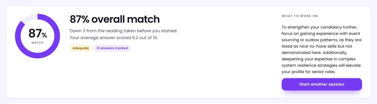
And the results page shows its working. Each requirement carries one of three marks, because they mean genuinely different things and used to look identical:
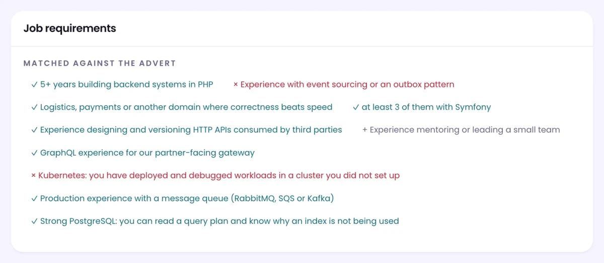
A tick is something the session showed. A cross is something a question asked about and the answer did not establish. A plus is something no question covered, which is not held against you at all: it is left out of the arithmetic rather than counted as a miss. Blaming a candidate for a question we failed to ask would be the easiest way to make the number meaningless.
Answers are marked on what they actually contain
This one came out of looking at our own data and not liking it. Across several hundred marked answers, roughly half had scored exactly 6, and not one had ever scored 9 or 10. A mark that lands on the same number half the time is not telling you much.
The cause was asking for a single number. Looking at the written feedback for answers that all scored 6, it ranged from "basic understanding" to "detailed explanation"; the judgement was being made and then flattened.
So a mark is now built from what an answer demonstrably contains:
- whether it answers the question that was actually asked
- whether it gives a specific example of something you did, rather than what one generally does
- whether it puts a figure on the outcome, a number, a duration, a rate
- whether it names a trade-off, a limitation, or what you would do differently
Those four decide the mark. The practical reading, if you want to score well: a worked example from your own experience is worth more than a fluent summary of the theory, and a number attached to it is worth more again.
One honest note from our own data. Across the real answers we tested this against, almost none quoted a figure. So 9 and 10 are reachable now in a way they were not before, but they are earned rather than given.
Progress tells you what to fix first
The progress page now ranks your weak areas by what they have actually cost you, summed across every session: ten answers that each dropped two points are a bigger problem than one that dropped five, and the ordering says so.
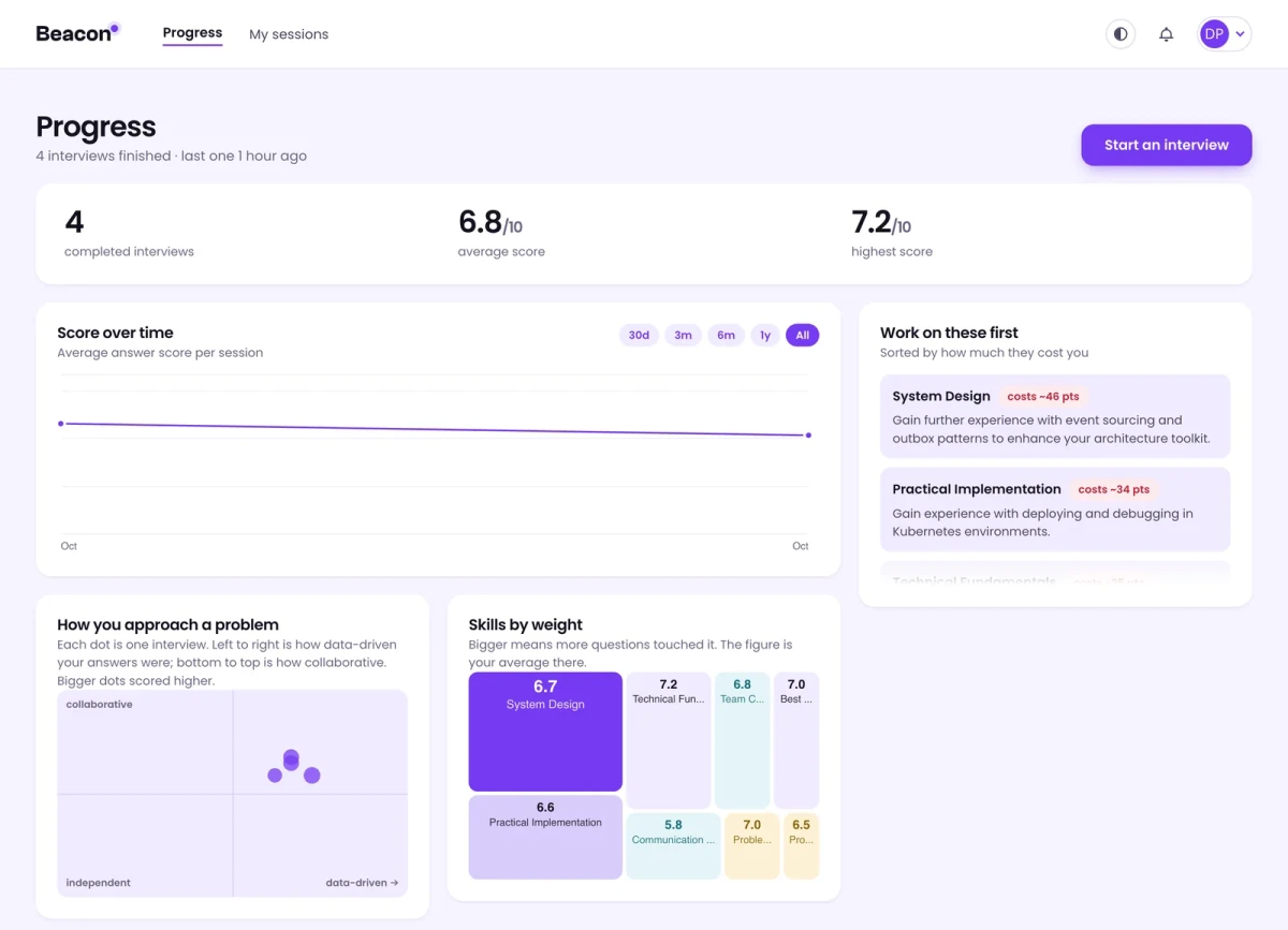
The figures at the top changed with it. They used to show your match rate; they now show your average and best answer score out of ten, which is the number the rest of the page is about.
What this means for sessions you have already done
Nothing was rewritten. Every session you have finished keeps the marks, the feedback and the results page it already had.
The one thing worth knowing is that a mark from before this change and a mark from after it were produced by different arithmetic, so they are not directly comparable. If a session next week reads lower than one from last month, that is the finer scale rather than a worse answer. From here on they are all on the same footing.
If something looks wrong, tell us. Several of the changes above exist because we ran the product against itself, did not believe a number it produced, and went looking.